
Rules of the Game, Part 2: The Built-In Constraints of Comics
Every medium has its own parameters. The better you understand them, the more you can achieve.

In my previous post, I explained how it can be useful to be aware of the basic limitations that are baked into whatever your medium is. Word limits, layout formats, color palettes, deadlines… when you make these non-negotiable constraints part of your creative process, you can make them work for you.
Let’s explore an example: I'm a cartoonist, at a basic level, I'm telling stories using words and images on a series of rectangular sheets of paper.
I already talked about the blank page and how paralyzing that can be, but I figured out early on that when it comes to comics it's never really a blank page because, for starters there's always a box that going to contain the drawings, referred to in the biz as your “live area:”
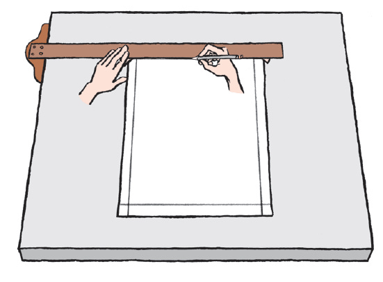
I have noticed as a teacher that there is some kind of psychological boost when you lay out that large rectangle inside the slightly larger rectangle that is the page. Somehow, the work area feels more defined. 1
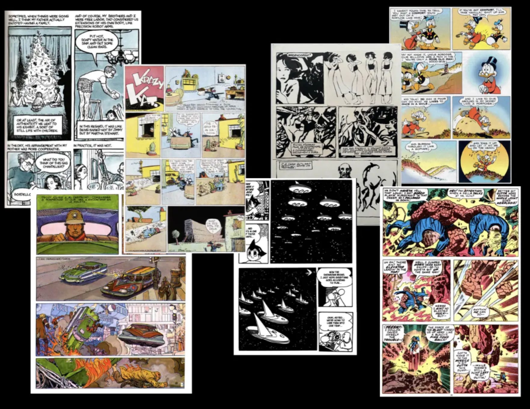
Furthermore, if you think of a comic strip or a comic page, you'll probably imagine little boxes of panels arranged in some kind of grid on the page:
I realized that even if I didn't know what I was going to draw yet, I could take a blank sheet of paper and draw a rectangular box on it, and then I could divide that into, say, nine panels: at that point, I already have a sense that there's a certain amount of space on this page. There's a certain rhythm implied by these panels. I might change it later on, but it gives me a starting point.
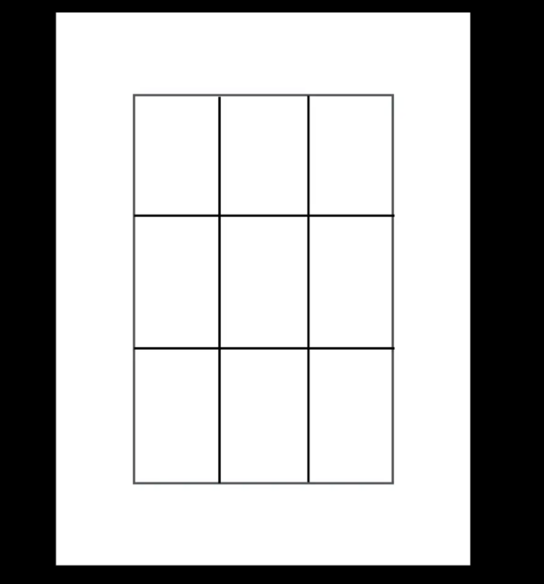
Becoming aware of that fundamental metronome-like visual rhythm of comics, was a crucial step in me learning how to tell stories visually.
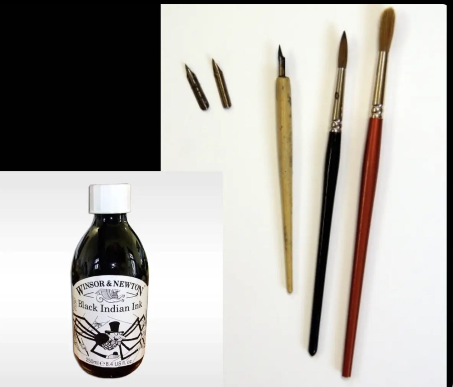
Comics also has a lot of constraints involving its creation. Until fifteen years or so ago, the vast majority of comics were drawn on paper using black India ink and a limited number of drawing tools—nib pens and watercolor brushes along with ruling pens, technical pens, and markers.
And up until maybe twenty years ago, the majority of comics were printed on really cheap paper, often newsprint. So that required that the art be very simple and the colors be very flat and easy to scan by the eye so that even if something was printed, all smudgy and the colors were out of register, it would still be legible.
If you conjure an image of “comics,” you’re likely to have this idea of bold black lines and dynamic shapes, and flat, bright colors—and you can see the dots, right?
That style was not an aesthetic decision. It came out of the fact that the printing was so coarse that artists had to come up with solutions to make the art “pop.”
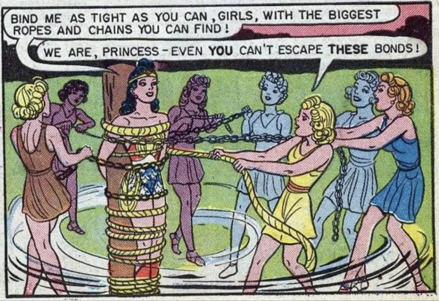
For example, H.G. Peter was the artist on the early Wonder Woman comics, and his art has this wonderful woodcut quality. But he developed that style specifically so that it would reproduce well on the technology that was given. He actually had a much more delicate drawing style where he would use crosshatching and very fine lines, under the influence of Charles Dana Gibson. But for comic books, which were mass-produced and printed on newsprint, he had to develop this very simple style, alongside many other artists of the Golden Age of American comic books.
And that has now become an aesthetic style that people choose to draw in, even when they're working digitally and can do whatever they want, because it's become codified and associated with comic books.
But at its origin, that classic comics drawing style came out of necessity and out of the limitations of printing and the materials that were available at the time.
What are your built-in constraints?
Think about your domain of work, for a moment and make a list:
What are these preexisting constraints and conditions that define your work, fundamental parameters that you really have no way around?
What are the formats the space considerations, the kinds of materials you might use in your work?
What are the deadlines built into what you do?
Just being aware of all of these limitations and parameters can help clear the decks in a lot of ways. Maybe it won’t give you your final solution—you still have that little blank page or screen to fill—but at least you know it's a rectangular blank format and it can only be, say, 35 seconds long or whatever the rules are in your given context.
Up Next: Getting Creative with Constraints
Try this experiment: make a drawing (a face or a quick still life) on a blank sheet of copy paper, then draw a rectangular frame (roughly 1 inch inside the edges of the paper) on another sheet of paper and make a second drawing. Do you see approach the composition, the scale, the background treatment differently in the two drawings?