
Rules of the Game, Part 3: Getting Creative
Deliberately imposing constraints on your work is an incredible tool

In the first two posts in this series we talked about the everyday constraints, the pre-existing, built-in parameters and limitations of any medium or creative endeavor.
Be sure to subscribe to catch the rest of this series.
In this post we’re going to probe a little deeper into this world of constraints. In addition to using pre-existing limitations to your advantage, you can challenge yourself further and gamify your creativity by introducing an extra constraint, one that acts as a kind of curveball. Let’s call this a creative constraint.
Why would you want to add an extra restriction to your work when we just finished exploring how many rules already limit your choices?
For one way to look at it, let me share an example from my own work that was only made possible thanks to the combination of everyday constraints and one self-imposed creative constraint.
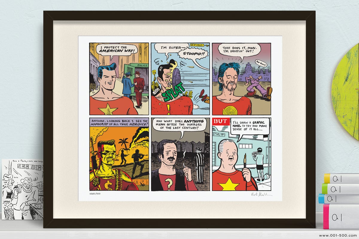
A History of American Comics in Six Panels
In 2012, I was asked to do an illustration for Scene, an alumni magazine from Colgate University. The subject was an article about the history of American comic books. Being an illustration assignment, it came with a series of built-in parameters which I had no choice but to follow: the subject matter, the deadlines for sketches and final art, the size and aspect ratio of the art.
So, while constraining, all of these parameters gave me a good starting point. But next came the content: how to convey 70-odd years of graphic history in a single image? An obvious choice would be to draw a montage of famous comic book characters but I felt like I’d seen that too often.
It was actually the art directors themselves who gave me an additional idea, which was to try to make the illustration itself a comic since it's about the history of comic books. That was a really great a-ha moment because now that I was making a comic, I knew I could use my grid and that would help me think more clearly about a sequential illustration.1
I arbitrarily divided my image area into six panels. That gave me a rhythm and a limit to the number of references I could jam in but it still didn’t quite solve the issue of how to concisely express the story of American comic books—everything from the first appearance of Superman up until the graphic novel era of the early two thousands.
What I needed was an additional rule. I needed to make it more difficult to myself, to paint myself in a corner so that I would stop fretting and be forced into problem-solving mode.
So I asked myself: what if each panel has the exact same composition, so that I have to figure out a way to take these very static images that repeat and tell the history of comics through those images?
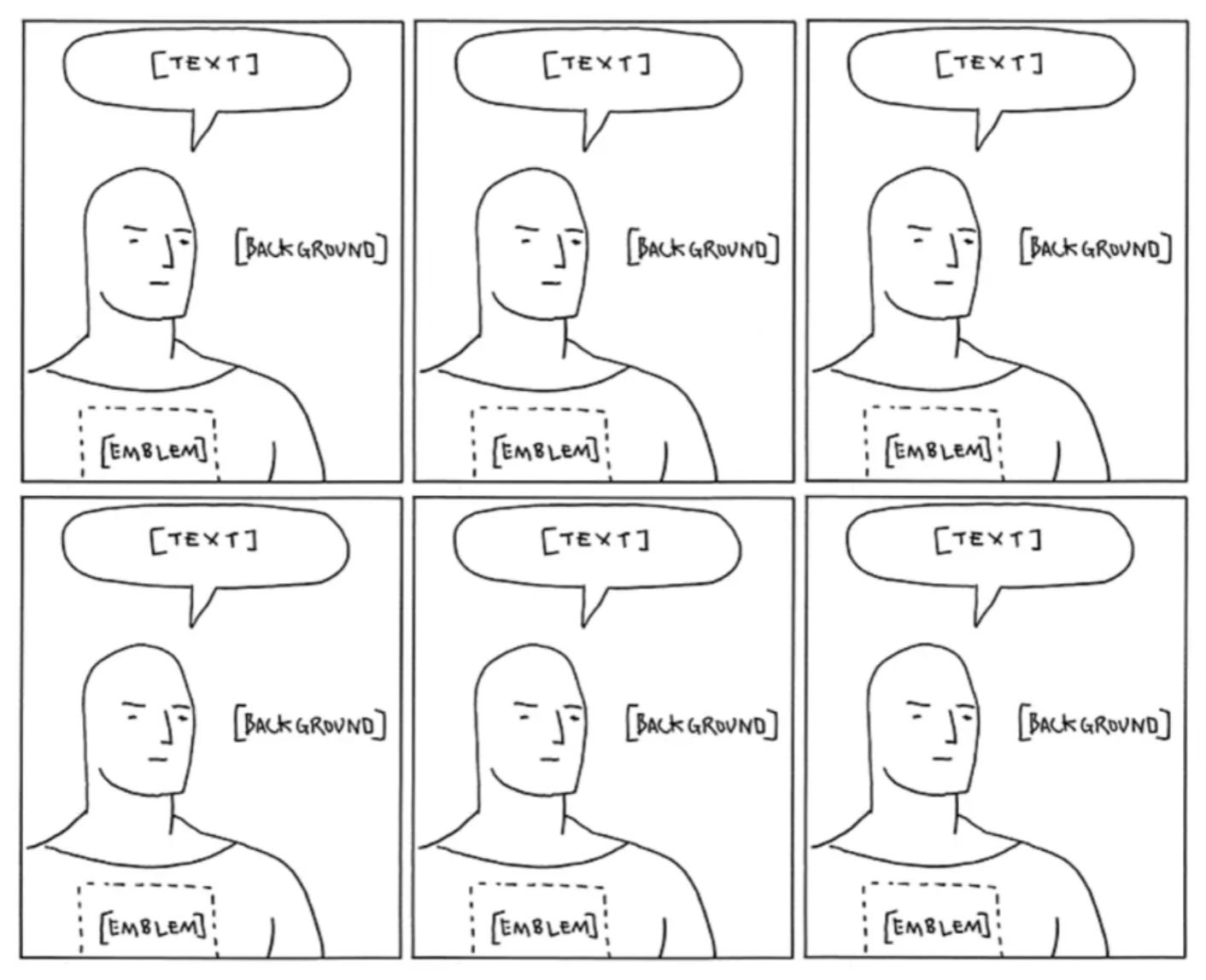
In some sense, that made it even harder because there was no story to tell, there was no movement from one panel to the next. But what I realized was that I could make little changes to each panel—changing the costume, changing the backgrounds, changing the dialogue in each panel—that when combined, might give a holistic sense of how American comics grew and changed over this time period. Then I was able to go through my book collection and choose six key moments from the history of American comic books (there are more than that, of course) that would get that idea across in six panels:2
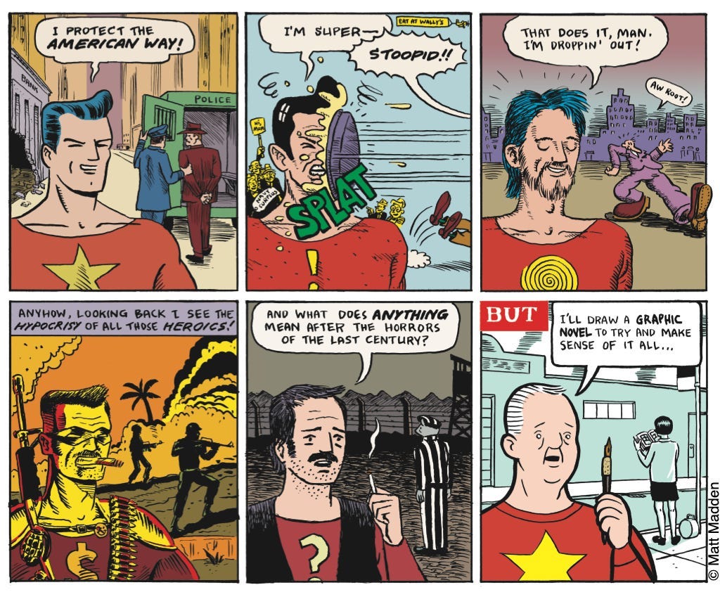
I was pretty pleased with results. And in fact it became my most shared image on social media (back in the days of Tumblr).
I attribute the success of this comic to the combination of both kinds of constraints I’ve been writing about here: on the one hand, I was given a bunch of parameters by my ADs, then we added another one—turning the single image illustration into a comic—and finally I gave myself the out-of-left-field challenge to use the same composition for each panel. And it was that extra constraint, the weird, self-imposed one, that really brought it to the next level.
And now a message from our sponsors: me!
If you’re a fan of my “History of American Comics” comic, you can actually purchase a lovely, signed, offset lithograph poster of it.
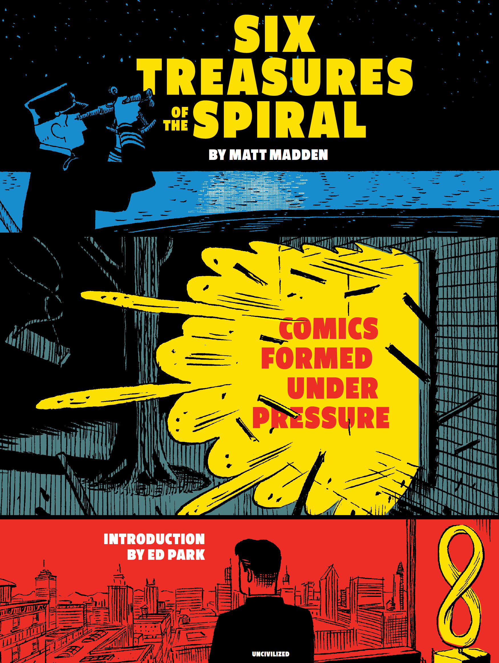
And if you want to have it in book form, the comic was recently reprinted in my collection of experimental comics—all made with the types of creative constraints I’ve been writing about here—Six Treasures of the Spiral: Comics Formed under Pressure, available from my publisher or ask your local independent bookstore.
Up Next: A Few Prompts and Pointers To Get You Started Using Creative Constraints!
It was also an unexpected boon to be allowed to make a comic as an illustration—any of you cartoonists out there who have worked in editorial illustration have surely experienced the reluctance of art directors—even comics fans—to let you do an illustration as a comic. Kudos to Karen and Rebecca!
For those who are curious here’s a list of the references in each panel:
panel 1: Siegel & Shuster’s Superman
panel 2: Harvey Kurtzman & Wally Wood’s parody, “Superduperman” from Mad Magazine
panel 3: an R. Crumb pastiche, featuring one of his iconic “keep on truckin'” figures
panel 4: Alan Moore and Dave Gibbons’ Watchmen (this panel is copied pretty directly from a Vietnam flashback in the book)
panel 5: art spiegelman’s Maus (the panel I swiped the background from happens to appear in the article)
panel 6: the foreground figure is a Chris Ware character (equal parts Jimmy Corrigan and “Super-Man”) and the background is an invented out-take from the final pages of Daniel Clowes‘ Ghost World
Among the other details, I’ve always appreciated the way the colors in the six panels evoke their sources, esp. panels 4 and 6. I wonder if six panels of abstract color palates could produce a similar effect. Limiting yourself to just colors is a pretty tight constraint!
Also like that the star emblem returns in panel 6, since Ware had his own version of super-man in some of his comics.